Room styling tips that make an impact.
Do you remember the Seinfeld episode with the “close talker”? Ever been in that situation? If you have, you know how important space is to how you feel in a social situation. Did you know that the same thing applies to how you arrange your furniture? Could your sofa possibly be making a potential buyer feel uncomfortable and want to keep their distance?
How you arrange your furniture has a big impact on how your house is perceived online and in-person by your future buyers.
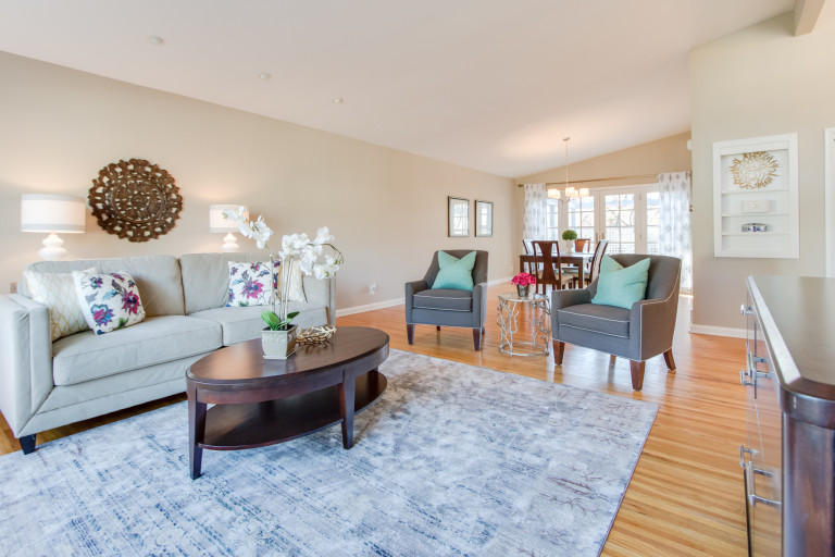
Photo Credit: Ashlee Hall
Believe it or not, there is a lot of psychology grounded in staging and a good floor plan is a huge part of conveying a sense of space and openness that can sell a house quickly. There is a whole science devoted to how space affects us called Proxemics and we can use the lessons learned in that research to create rooms that put your buyers at ease and willing to make an offer.
Here are 4 room styling tips—foundation, function, flow and focal point–to keep in mind when staging your living spaces for listing photos and in-person showings:
4 Room Styling Tips When Staging Your Living Spaces
1. Measure twice, move once
Measuring is the foundation for starting to create a great floor plan. It is probably your most important and most overlooked step in arranging or rearranging your furniture. Who wants to keep moving the sofa around because it doesn’t quite fit where you want it? It may seem like a drag, but it is so much better to take the time to measure and plan a little ahead. It will save your back too!
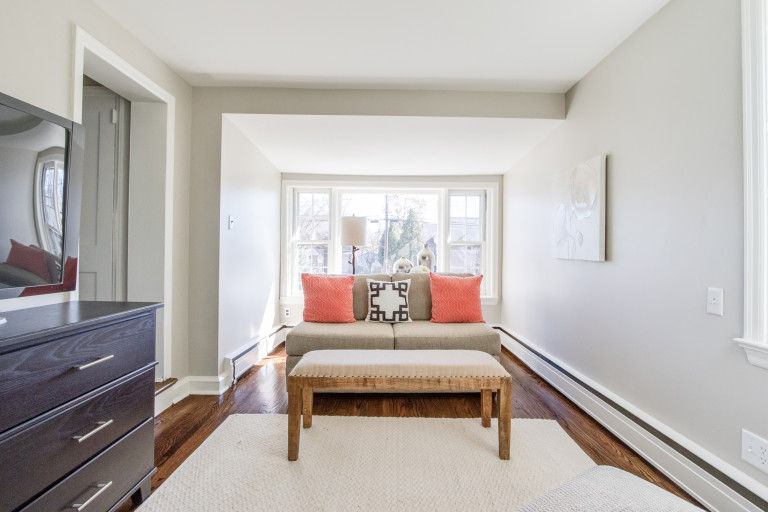
Photo Credit: Ashlee Hall
2. Function
Function is super important in creating a great floor plan. This is like setting your goal before you take on the task of moving anything. You want to understand how the room should function so that you can put your furniture to work to create that function.
Buyers want to know how they will function in a space and more importantly how their furniture fits into that function.
A great seating arrangement allows for nice conversational areas that aren’t too crowded and aren’t too dispersed. A few rules of thumb are:
- Creating a “U” shaped seating arrangement is a basic way to make a solid conversational area.
- Distance between a sofa and coffee table: Allow around 18″ between the table and sofa edge to give enough leg room but to be able to set down drinks or reach appetizers without straining. Coffee table heights vary greatly, but a good rule is to keep the table height and seat height within 4 inches of each other.
- Distance between seating furniture: Aim to provide between 3.5′ and 10′ between seating options to help the conversation flow without crowding a room.
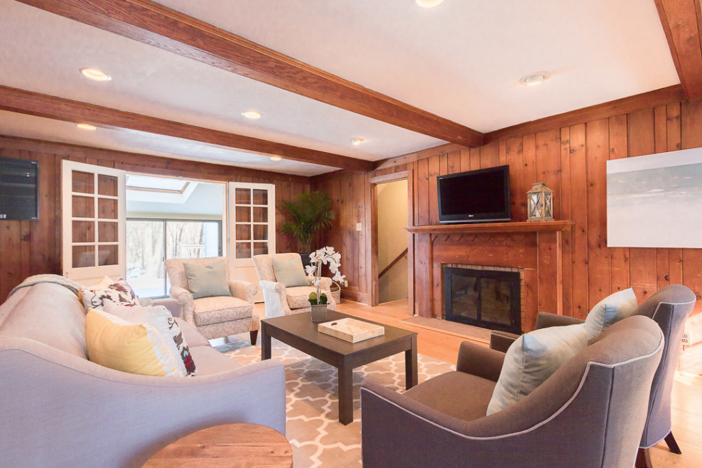
Photo Credit: Ashlee Hall
3. Flow
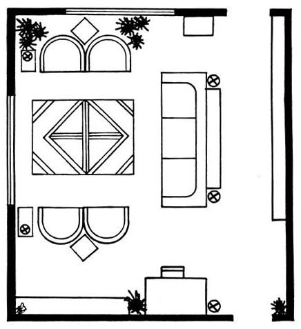
Flow refers to how traffic moves through your space. Do you have a television in this room; is it a room that you have to walk through in order to get to the kitchen or main living area? Once you understand how the room is traveled through, you can make a floor plan that helps guide the traffic pattern. You can see in the image below that there are two entrances to the room and the furniture has been positioned to create a hallway connecting these two egresses.
4. Focal Point
Your focal point is what you want to highlight to sell your house: a fireplace, a great view, the size of the space, a wall of windows, cool architectural details, etc. It is what will make your buyers want to enter the room to get a closer look. Knowing your focal point makes it a lot easier for you to arrange your furniture to showcase it more effectively. But, what happens if you don’t have a natural focal point in a room? Let’s explore how you can create your own:
- Size: Large items automatically attract interest (think about a bed in a bedroom). Start by putting the largest piece of furniture against the largest wall to help traffic flow. A bed is a natural focal point for a bedroom, and a sofa is a great focal point for a living or family room. Rugs also command attention and anchor the décor, so they make great focal points, too.
- Color: You can totally influence mood and behavior with color. A contrasting wall color behind your sofa or bed is an excellent way to create a focal point. You can also use small intense colors on accessories such as pillows to direct the eye to a seating area and focal point. But a little goes a long way – color that is too intense can be a turn-off.
- Light: Your eye travels easily to where it can see the best. Lighting is essential to giving attention to the main area of the room, such as a chandelier over a coffee table.
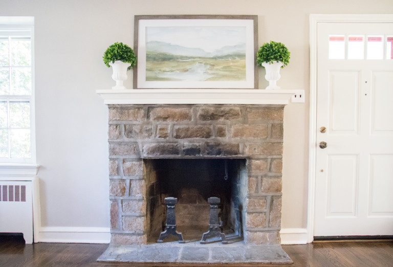
Photo Credit: Ashlee Hall
Is it possible to have more than one focal point in a room? Absolutely, if your room is designed for more than one purpose, such as a living-dining combination room, or a bedroom with a sitting area, you will need a focal point for each area to distinguish it from the rest of the room and to define its purpose. Just make sure the focal points agree that both sides of the room are equally formal or informal, and in the same decorative theme as the rest of it.
I hope that these room styling tips will help you attract the right buyer and make selling your home easier!
Leave a Reply