Full disclosure…when I first started my real estate staging business, I was not very good at explaining why something wasn't working in a room. The reason was that I really didn't know why I felt the way I did. I would just get this little voice nagging at me and I would struggle to come up with a delicate way to mention what to me was the inexplicable elephant in the room.
Flash forward all of these years spent working in nearly a hundred homes and spending countless hours with what I call my MLS porn, and I have discovered what photographs well and what doesn't and, more importantly, WHY.
Today, I'm going to walk you through one of the bigger elephants that I come across–that I wasn't always so great at articulating why I thought it was an issue. The dark couch.
It seems no one was immune to the chocolate brown trend in the 90's and early 2000's when it came to buying their couch, except me with my ridiculously frilly floral shabby chic sofa.
Don't get me wrong–updating a brown couch is WAY easier than updating what I chose for my house. So, I am thankful that most people were not as daring as I was. But, the dark couch definitely has its drawbacks when getting ready to sell.
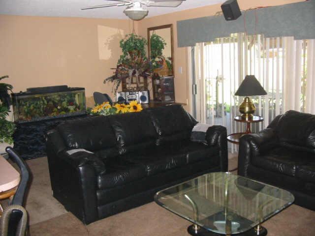
There is a lot wrong with this MLS photo above (not one of my client's or Realtor's, by the way) but one of the biggest problems is the couch as the focal point…or is it the fish tank… or is it the sunflowers…oh wait, focal points is a whole other blog post.
Back to the couch. Do you see how it recedes in the photo and doesn't really jump off the page? That is actually a problem in MLS photos because the couch absorbs light and makes the room feel heavy and dark, even if it isn't.
And, people buyers respond to color, pattern and texture even in listing photos so we have to doll this thing up!
The beauty is that with a little finesse, you can turn what could be a black hole in your listing photos into a fun, punchy focal point.
The Key is Contrast
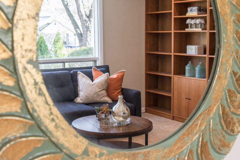
Contrast is all about differences used to create visual interest. In design, contrast is created through color, varying light and dark elements in a space. Even the late, great Robin Williams had something to say about contrast.
“Contrast is created when two items are different…for contrast to be effective, it must be strong. Don’t be a wimp.”
If you don't already have a copy, check out Sell Your House in 72 Hours, where I touch on the concept of contrast. I dive even deeper into my online course, Stage Your House To Sell Mini-Course which has a whole module devoted to accessorizing as well as cheat sheets to help you style everything from your sofa to your coffee table.
Let's start with your average dark couch to show you what I mean:
Styling Tips for a Dark Couch
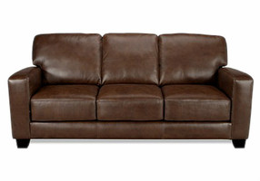
This is how I typically see a dark couch styled with dark pillows and usually a dark area rug. No contrast (and not good for an online listing):
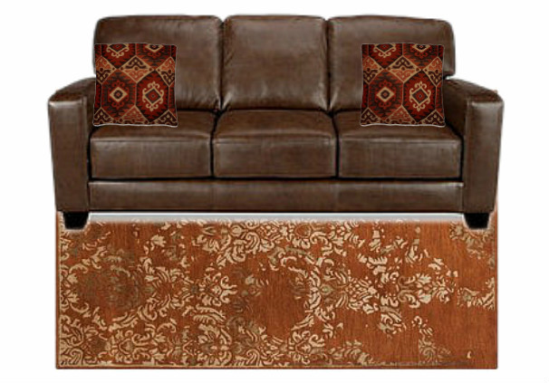
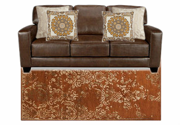
Without changing the rug, look at what changing the pillows does. Do you see how it is beginning to come to life?:
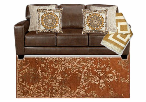
Better still, add a light-colored throw:
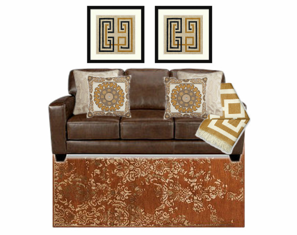
And, if you can, add art above that is lighter in color to create even more contrast:
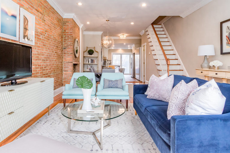
Here is a real-world example of how we added contrast–through fabrics, rugs, furniture, art, and metal finishes–to a room with a dark sofa to keep the space feeling light and airy.
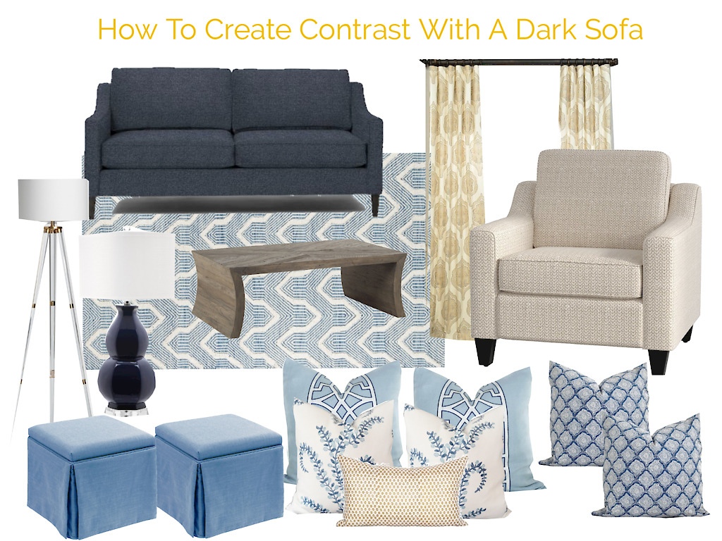
Here are some other beauties that you can surround your dark furniture with to really make it pop (you can find shopping links here) whether you are selling or dwelling:
Happy shopping!!
xo,
Lori
Leave a Reply