Are dining rooms dead? Gosh, I hope not. Because just about every house our Real Estate Staging team works with has dining rooms!
I have a feeling that the people spreading this rumor are the same people that keep saying email is dead. I've got two teenage boys who are just discovering the value and importance of email. So, I'm gonna say, yeah, email's not dead either.
What I do know is that the formal dining rooms of the last millennium are definitely dead.
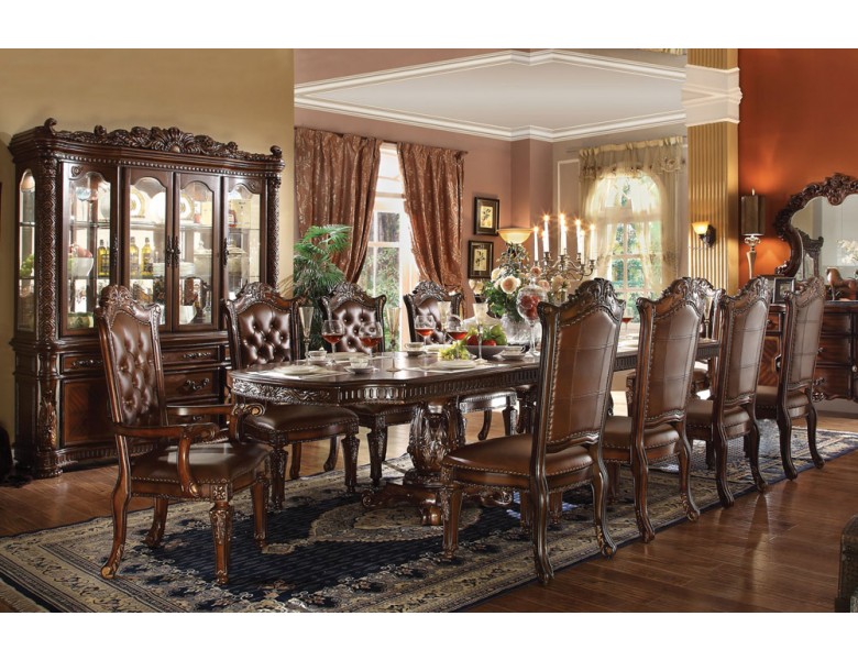
Younger buyers are looking for fresher, more casual designs. And honestly, when we walk into houses with the matched furniture sets and the formal china cabinets that dominated pre-2000's dining rooms, the energy feels stagnant. And brown….they feel very brown….
Disclaimer: to anyone who I know and love who has a formal, dark, brown dining room (myself included)…it is just fine….until you go to sell…
The dining room is often what I consider to be a SIR (super important room) so they have to look delish since they are one of the first rooms that people see in most houses. I go into more detail about the concept of SIRs in my e-book “Sell Your House In 72 Hours” that you can download here for free.
Below is a beautiful example of how to use a traditionally dark finished dining table but add lightness and modern touches while still feeling special.
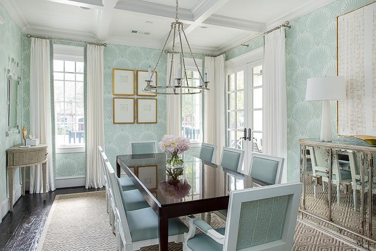
So let's break down how we advise clients to break up the brown to modernize the feeling of a traditional, formal dining room. And we don't even start with paint most of the time…!
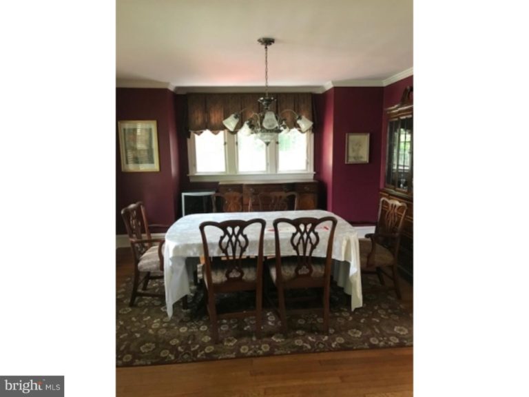
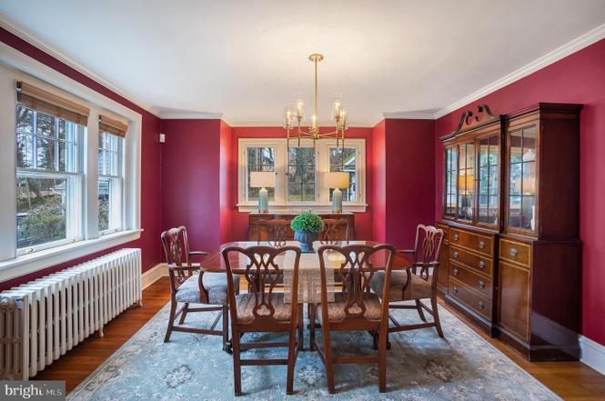
Here is a dining room where the homeowners had left behind their dining set and we added modern touches (without painting) to help this house sell super fast.
Create a Modern Dining Room With These Updates
1. focal point
Our team always starts with the focal view that buyers will see from the first entry into any space. In this case, it was the triple windows in the niche. We also removed the art on either side of the windows to enable the eye to not get distracted in the online listing photo. If that had been a blank wall, we would have added large-scale art in light colors that incorporated a very small amount of the wall color. On dark walls, the goal is to create contrast by using lighter colors. In this case, the dark, formal window treatment was removed and light-colored, modern lamps were added.
2. chandelier
Next up…what's at eye level. The first thing at eye level for most people in a dining room is the chandelier. And there are so many cool chandeliers on the market today that don't cost a fortune but can really update the look and feel of a space. And don't be shy mixing styles and metals. Again, dark walls and table should have a metal finish that is lighter in color like a satin brass or polished nickel. Here is a shopping list of our favorites to update even the most traditional spaces.
3. area rug
There aren't too many opportunities to add color into dining rooms–especially those that are dominated by large china cabinets on a focal wall so we like to max out adding color and pattern in with area rugs. And we even lay them over wall-to wall-carpet all the time. The mistake in the before picture is that the rug is also dark. If the tablecloth wasn't on the table, it would be a sea of brown and with the rich, dark wall color, would just feel like a void. That's why we chose the light-colored patterned rug to go into this room.
4. window treatments
Next up is to add some simple modern profiles to the windows. See in the image above how the drapes are straight and go to the floor? No need to add tie-backs or cover the rods with valances. Simple is best. We didn't add them into this room because there was enough beauty and the room didn't need them, but most dining rooms can benefit from them. Here is a post with my favorite window treatments and here is a post with my favorite hardware for styling.
5. tablescape
I am not a fan of setting a table to style it for photos. It feels “stage-y” to me. I'm also not a fan of tablecloths. They just don't photograph well as you can see above. What my team and I love is to style the table with light-colored, natural table runners and modern feeling accessories. In the image above, we actually placed the runner in the opposite direction to draw your eye back to the focal point. This is also a neat little trick to do when your runner isn't long enough for the table ; ). But, again, it adds the much-needed contrast to the table by being a lighter tone than the wood.
6. chairs
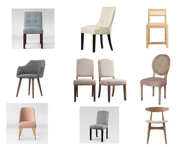
And the last resort that we rarely recommend but use all the time in our vacant styling work is the add upholstered or modern light wood-toned chairs and benches to dark tables. Here are some of our favorites for styling (read: inexpensive and ship quickly!)
So over to you! What dining room challenges have you faced and what do you think has the biggest impact to change the look and feel? Would love to know your thoughts!
xo,
Lori
*affiliate links are included in this post. To learn more about this you can read this. Thanks!
Leave a Reply