I've been sharing these little home staging tips and gems over on social media but realized that Facebook only spreads the love so far. I have some great tips for better listing pics and I wanted to make sure that you get to see every one of them! I've also included links to other posts that can take your learning even deeper. Hope you find these helpful!
Create a Focal Point
Real Estate photographers love to photograph focal points in a space: mantels, beds, dining tables, built-in bookshelves, sofas, long walls, windows. Make sure that each room has a clear, simple focal point for the photographer to compose a great shot.
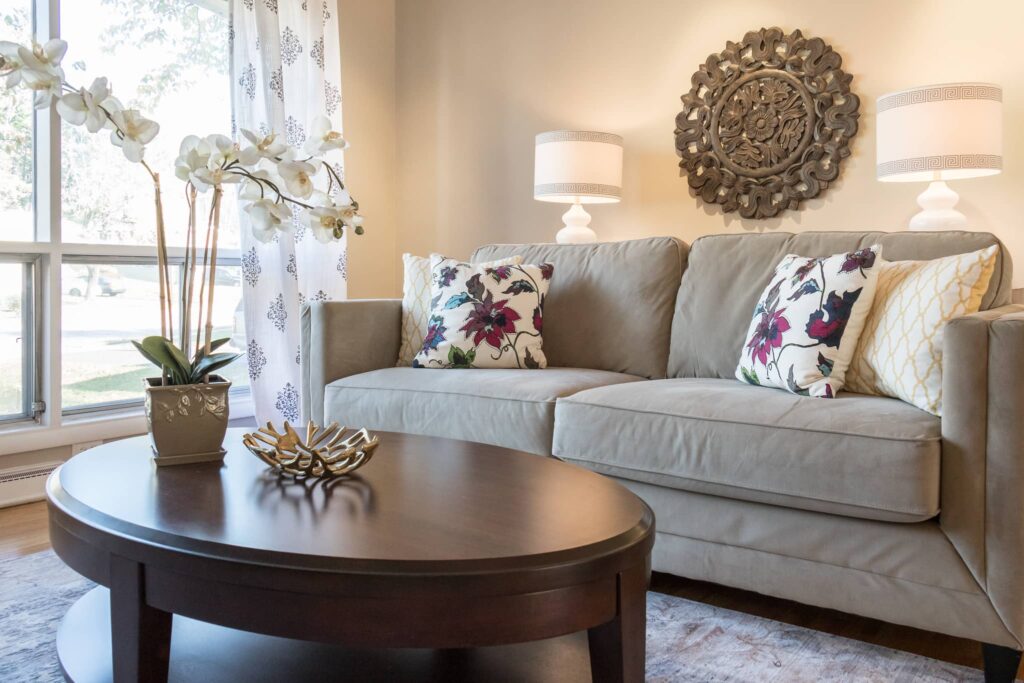
photograph: Ashlee Hall
Create Contrast
Dark furniture can be a bossy diva that sucks the life out of a room in a listing photo and we definitely don't want that. For your listing pics to jump off the page and shout “pick me, pick me!”, add contrast like light-colored pillows, light throw, light area rug, and curtains. I did a deep dive on this here because in staging we encounter so much dark furniture.
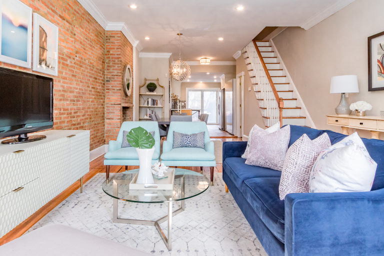
photo: Ashlee Hall
Finish the Look With Window Treatments
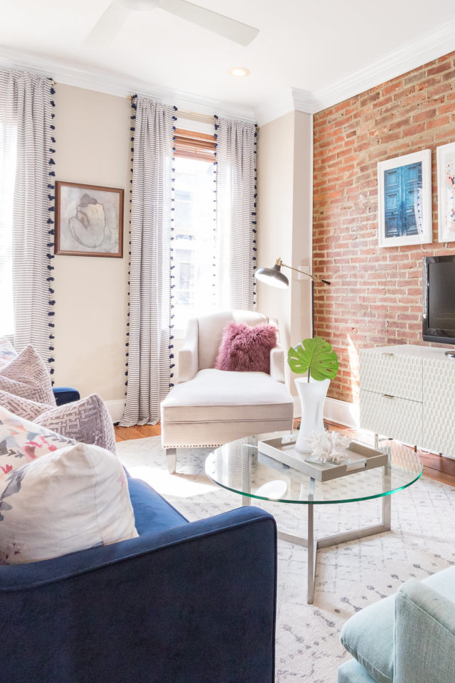
Ya know, sometimes the best thing to make a room sing like Beyonce is a set of curtains hung as high as possible. Oooh but don't forget they still have to touch the ground. Queen B would never approve of anything less. You can learn more about window treatments than you ever thought you needed to know here and here.
Toilet Seat Sown
May seem obvious for better listing pics, but if I had a dollar for every time…..
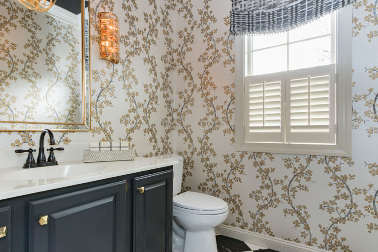
photo: Ashlee Hall
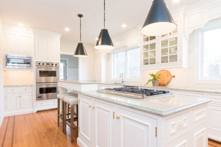
Clear Kitchen Counters
I'm not a fan of nude photos but nude (or nearly nude) kitchen counters…now those I'm into in a really big way.
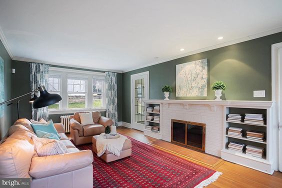
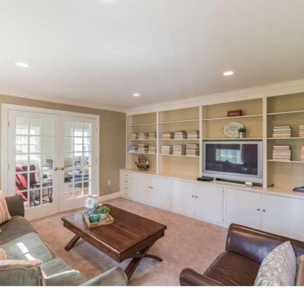
Simplify Bookcases
What gave people the crazy idea that books are the only things meant for bookshelves? I'ma tell you right now, the camera rebels in the face of too many literary embellishments. But, if the thought of packing it all up makes you want to hide under the covers eating Cool Ranch Doritos, I get it. I really do. So…..turn the pages to face out and stack them on their sides. Happy you, happy camera, happy dance when you sell fast.
Art Hanging 101
Staging for pics. Art. 3 rules. Big is always better. 50-90% of the length of the wall or furniture that it is above. Hang low. No, lower than that. Approximately 60″ to the center of the art from the floor or 6-10″ above the piece of furniture it is over. Hang in the direction that mimics the wall. Long, wide walls need long, wide art. Tall, narrow walls need tall art. Here's a fun post about what to do when you have an uber long wall and art alone is not the solution (and it includes my favorite sources for frames).
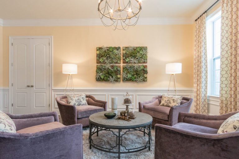
photo: Ashlee Hall
The Power of the P (pillows, of course!)
Unicorns are not as magical as throw pillows. Trust us on this. They can make the tiredest sofa or chair get a little pep in their step. They can make a bed feel layered and luxurious. Start by thinking about the furniture they are on. If the furniture is dark, add light pillows. If the furniture is light, add dark pillows. 4-20″ pillows work great on the average sofa. 3-20″ pillows work great on the average bed. Oh and note to self, don't prop pillows on their points. Listing photos should be a diamond-pillow-free zone! I wrote in super detail about pillows, how to choose the size, how to combine them and where to get some really fun ones here.
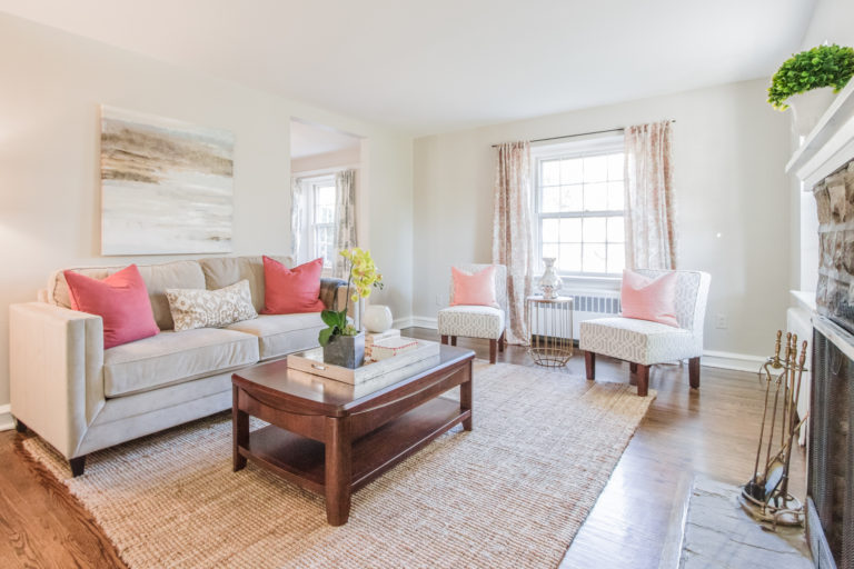
photo: Ashlee Hall
Styled Table Surfaces
Tall. Medium. Short. In a triangle. Maybe on a tray. Your listing photos will look amazing when you accessorize that way. #socornyiknow I wrote a post here about where to find great coffee tables, what to use if you don't have a coffee table and how to style a coffee table perfectly every time here.
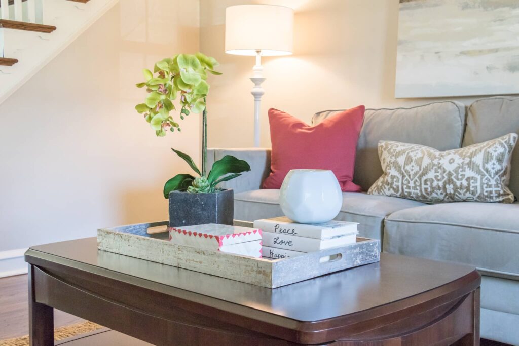
photo: Ashlee Hall
Lamp Size Is Important
We have an epidemic in this country that no one wants to talk about. But, I'm here to open the discussion. It's called small-lamp-on-beside table syndrome and it is killing your local real estate stylist every time he or she see's it. Lamps next to the bed should be somewhere around 24-27″ high. Not only to give you nice light for watching Netflix on your ipad in bed but to add a gorgeous focal point that looks incredible in listing photos. Here are my favorite–gorgeous, high quality–lamps that are on Amazon Prime (yay!).
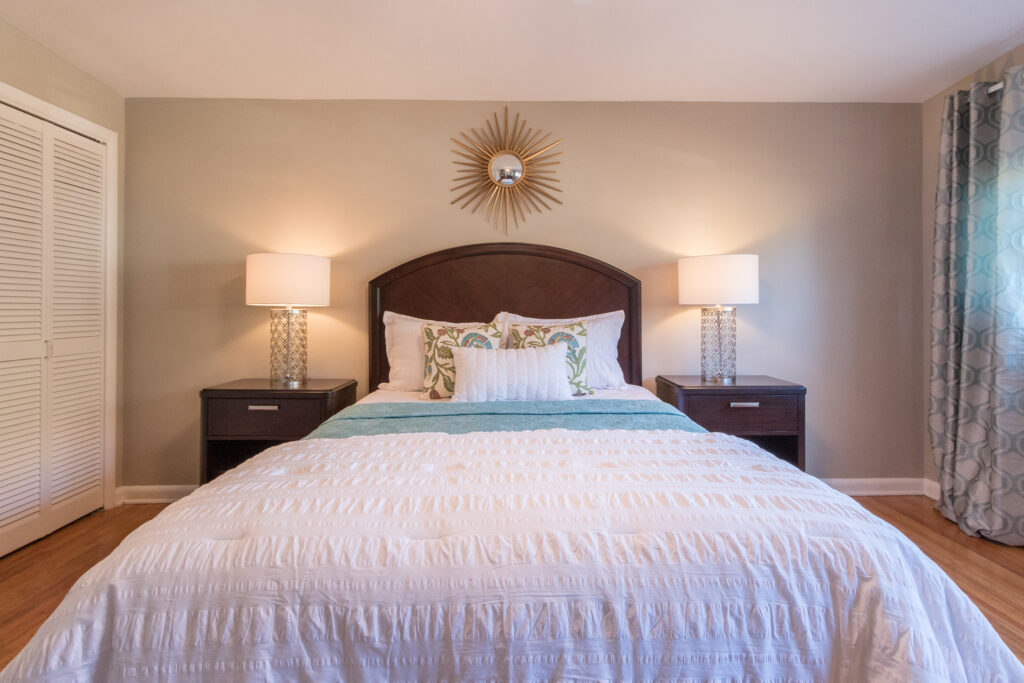
photo: Ashlee Hall
Banish the Tablecloth
Tablecloths. Let's discuss. Don't photograph well. Runners are the way to go. Thanks…so, so glad we had this talk. xo
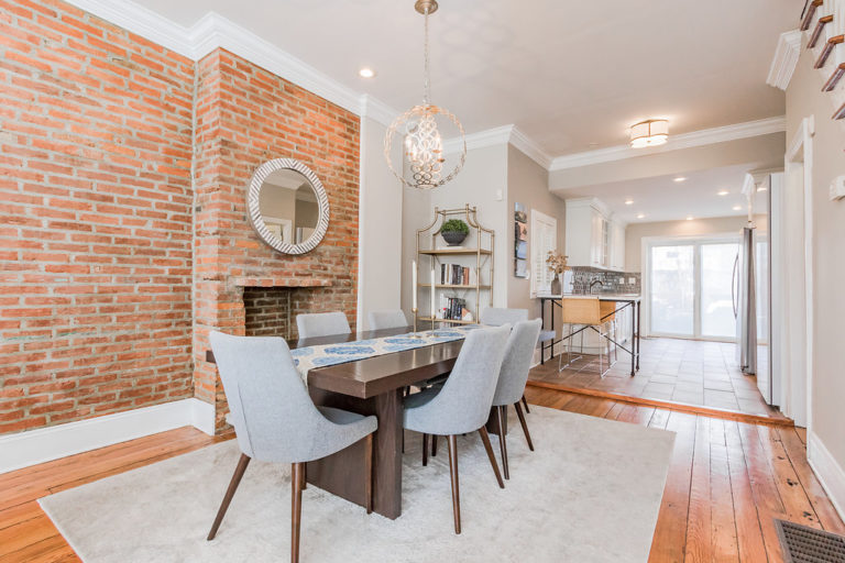
photo: Ashlee Hall
Bathrooms: A Rug-Free Zone
Category: rugs when staging. Great in living rooms, dining rooms, bedrooms, even layered on wall-to-wall carpet. Not great on bathroom floors or toilet seats. And my favorite rugs from Amazon are here for ya!
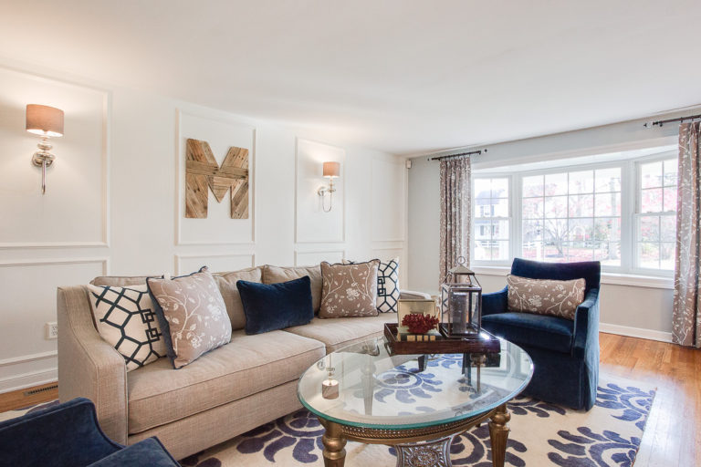
photo: Ashlee Hall
Add a Pop o' Green
If you woulda told me before I started this business that I would grow to love faux plants and greenery, I would have spit my prosecco out at ya. But…we should all be open to growth and new ideas. And I have learned that nice quality faux greenery can really add the little pop that some spaces need for listing photos, especially bathrooms.
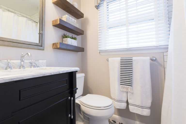
photo: Ashlee Hall
Update Cabinetry With Paint
You know how when you get a new haircut, it costs less than getting a facelift to make you look younger and hipper? Same for painting cabinetry in a bathroom or kitchen. Satin finish dreaminess in Sherwin-Williams Naval makes a huge difference! Here is a post with my favorite paint colors to update cabinetry–fun!
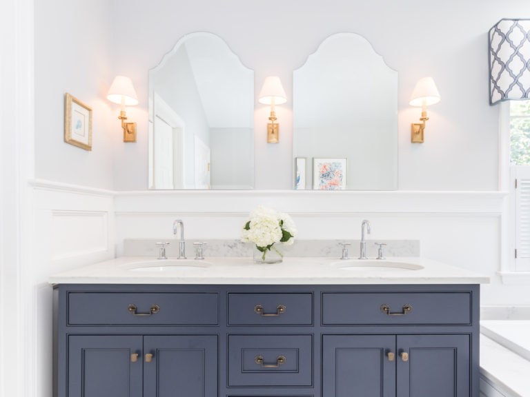
photo: Ashlee Hall
Hire Pros
Hire these three professionals: You can't skimp on any one of these. Trrrrust me on this. Professional Realtor. Look at their past listings, please! Professional Stager. Our expertise is an investment that you will get a return on right away (we will save you time and stress and earn you sh*t tons of money fast as compared to a novice). Professional Photographer. Typically this is not your Realtor.
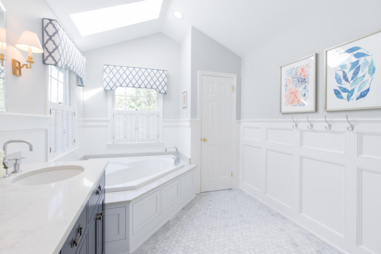
photo: Ashlee Hall
Add Modern Elements to Update the Feel
Sometimes the best antidote to a bathroom that needs to be updated is a fabulous new (cotton) shower curtain, modern towels, modern art and pretty greenery. Either that, or make the rest of the house so purty that buyers can't wait to dive in and renovate the bathroom. There is always that too…Speaking of that, I have three posts here, here and here about choosing tile if you have it in the budget to update.
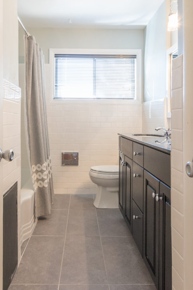
photo: Ashlee Hall
Bed Perfection
Let's talk beds shall we? Prop the pillows, roll down the top of the comforter, and make it with the mad perfection of Martha Stewart frosting a cake. Oops…wait…Martha says you missed that sock sticking out from under it…
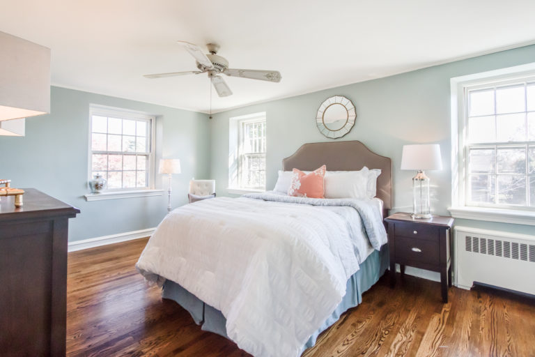
photo: Ashlee Hall
Media Cabinet Clean Up
Media centers with glass fronts doors. Awesome for your remote control function. Not awesome for your listing pics. Remove all light colored objects ooorrrr…. #stagerhack….place dark towels, dark shirts or dark trash bags over them. Poof–they magically disappear in the photos. You are so welcome, my friend! Oh, and to get a few ideas for un-media cabinet ideas check out this post.
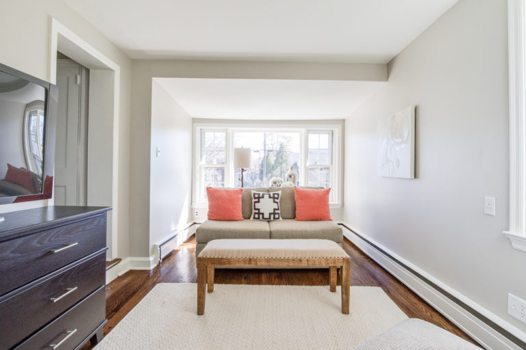
photo: Ashlee Hall
China Cabinet Clean Up
I love me some china cabinets. All those pretty dishes and all. But…they legit do not look great in listing pics if they have a lot in them. If you don't use those items every day, go ahead, pack them up. You'll be one step closer to your super fast sale.
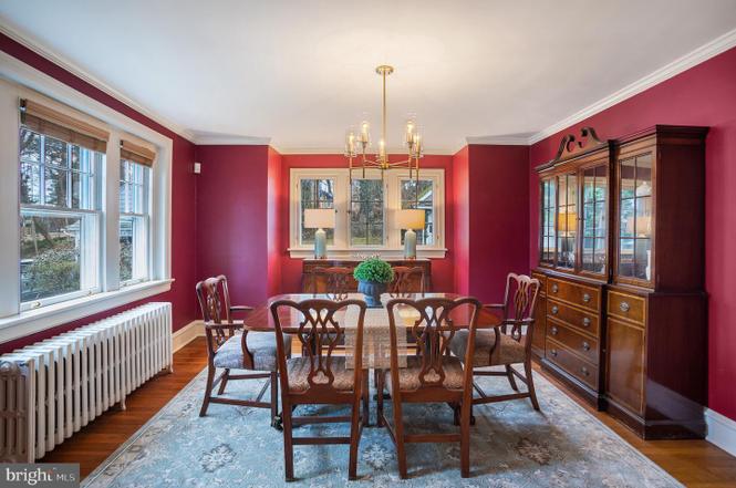
Create a More Casual Vibe
Today's buyer is living more casually. Sometimes it makes all the difference for your sale to remove formal window treatments–even if they cost a fortune when you had them made–and replace with straight curtains that go to the floor. That hurt my heart to say, but it's true….
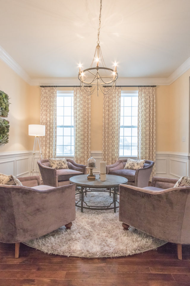
photo: Ashlee Hall
Phew! That is one epic post–haha! I hope that these tips will help you to create better listing pics! If you want even more resources to stage your listing better, go ahead and download your copy of my FREE e-book “Sell Your House In 72 Hours” here to unlock access to a few more bonus staging goodies!
xo,
Lori
Leave a Reply