Inside our home staging mistakes lie opportunities.
And while mistakes aren’t what we intentionally strive for, they are necessary. Necessary for our personal growth, understanding and wisdom. And, not to mention, how to become better at staging a house!
I've made a ton of mistakes in my staging business. Some were super painful but most were not–thank goodness. But, it was in the mistakes that I honed my home staging abilities and gathered my home staging philosophy.
Little did I realize what a gift it could be to all of the clients and stagers who have been able to learn from me after I tripped over myself on the way to figuring some sh*t out.
So what are those home staging mistakes?
Well for today, let’s just dive into the home staging mistakes because, I’ma tell you, if we add in all of the business mistakes, we’d be here for a while!
The Camera Is Super Bossy
Since the first point of any real estate sale is the online listing photos, we gotta be thinking about the camera from the minute we start the staging process. Not thinking about the camera as an integral part of the home staging process is the BIG mistake most people make (and no judgment, I did too!).
How can we possibly create spaces that photograph beautifully without consulting the camera first?
You can’t and you shouldn’t because, let me tell you, the camera can be unforgiving and judgemental.
While our brains are naturally wired to tune out most things in our environment, the camera sees it all and reveals it in listing photos. Through the lens of a camera, everything gets amplified and uncovered. Like everything. And, just like it adds 10 pounds to us, it adds 10 pounds to our things. Awesome news, right?
So what can you do?
Well, whether you are a Stager, Realtor or seller, you can start by getting out your camera! Taking a look through the lens of a camera will give you so much information to start figuring out what a room needs in order to start the staging process. It’s like turning on a light switch and getting to see exactly what needs to be done. It’s seriously magical! Go ahead, try it, I’ll wait…
Create Beyonce Level Focal Points
Real Estate photographers loooove to capture focal points so let’s give them a diva in each room. Whether there is a natural focal point in a space like a fireplace, bookcases, beds, windows, etc or you need to create a focal point with furniture, accessories and art, let's make it beautiful, simple and symmetrical.
You see, the camera–and buyers’ brains–wants a clear focal point that is simple and symmetrical. Less is always more in staging a house so no need to fill a focal point with too many accessories. And no need to be super creative either. What you have on the left side of a focal point can be balanced with the same thing on the right side. That’s totally like getting the Staples “easy” button!
You also want to be strategic about where those focal points are in each room. Understanding how a room will be photographed and how buyers are likely to travel through the house will guide you as to the best location for a focal point. We want them to be in places that catch the eye easily in the listing photos and in person.
Create Contrast
Contrast is simply the layering of dark and light colors in a space. I wrote a lot about the concept of contrast in this blog post about how to create contrast with a dark sofa.
This room below is a really nice example of how to mix light and dark to create a buyer swooning room. I mean, that’s the point, right, to make the buyers swoon?
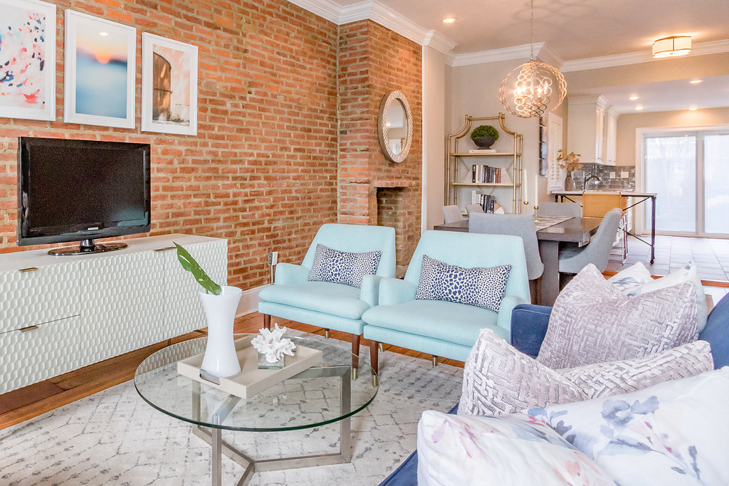
A room that is too heavy in either direction: all dark or all light can read flat in listing photos and we definitely don’t want that. Our goal is to create spaces that tap into the emotional centers of your buyers and since humans (and the camera) love contrast, let’s give it to them!
think about Return On Investment (ROI)
We want to be hyper-focused about the return on investment of our sellers’ time, energy, effort and financial resources. At RHI, we are committed to the idea that all actions must have a return on investment. We are so committed to this that we have identified rooms with the highest return, as well as which walls in those rooms, have the highest return on investment. We tend to steer away from large-scale remodeling because of the time and money involved in favor of strategic styling, almost exclusively with what our seller owns already. We even try to avoid having a property painted if we feel that art and accessories can do the heavy lifting.
keep Positive Energy
This part may be the most important so please don’t skip this. When going through the sales process, things can be stressful. Not everyone is happy or prepared to move.
But, as much as we can, we must try to inject the process of getting a house ready to sell with positivity. I am a firm believer in our energy creating our actions which create our results. I have seen this play out over and over again in our work. Our team is dedicated to making our sellers feel as good as possible about the staging process and making them feel really supported. This positivity comes back to our clients so many times over in the form of super fast sales and I know it is the positive vibes at work just as much as moving the sofa 3 inches to the right.
Wrapping it up
Our goal is to create staged spaces that appeal to buyers online first and foremost. The first step in getting the staging process started is thinking critically about the listing photos and making sure all recommendations and actions are aligned with how a camera captures a space. Once you do that, the in-person buyer experience at a showing just naturally falls into place. And injecting your home staging process with some fun and positivity will just seal the deal.
If you want to learn more about home staging mistakes and other tips, then you must grab your free Sell Your House In 72 Hours E-Book. This gem outlines our approach to Styling Evaluations so it appeals to a seller, stager or realtor. Let's do this together!

Leave a Reply