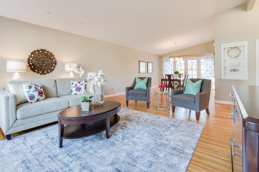
One of the things that evoke some fear in me when we are looking at a vacant listing is an uber-long wall. There are so many of them out there and we just worked in a house with two of these oversized behemoths last week!
The reason that they cause me to panic a bit when we do a vacant house is that we are limited in the size and type of furniture that we can rent so I don't have the luxury of using a large media cabinet or armoire to fill a wall.
A long wall can also be challenging when you think about styling a room for photos because you need to strike a balance between filling the space with something significant to create a great focal point and not tchotchke-ing it up.
For a lot of people the urge to just start placing art all over it can be overwhelming.
And a lot of people do that.
And you are not going to do that.
The problem with addressing a long wall with art by itself is that it can become visual clutter like the image below:
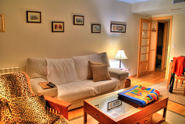
The art is also WAY too small and WAY too high which is also very common to see. I talk about how to choose the right size art and how to hang it here. And, let me just say, the rules that I share in that post apply universally whether you are selling or dwelling.
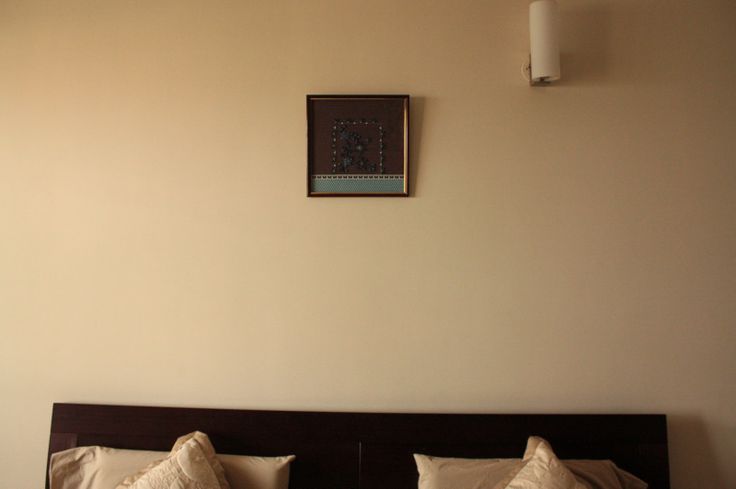
Now, if you want to take the minimalist approach, you can end up with the opposite:
So, let me save you from getting into a long wall abyss and share with you some options that you can try to accessorize a long wall.
Options to Accessorize a Long Wall
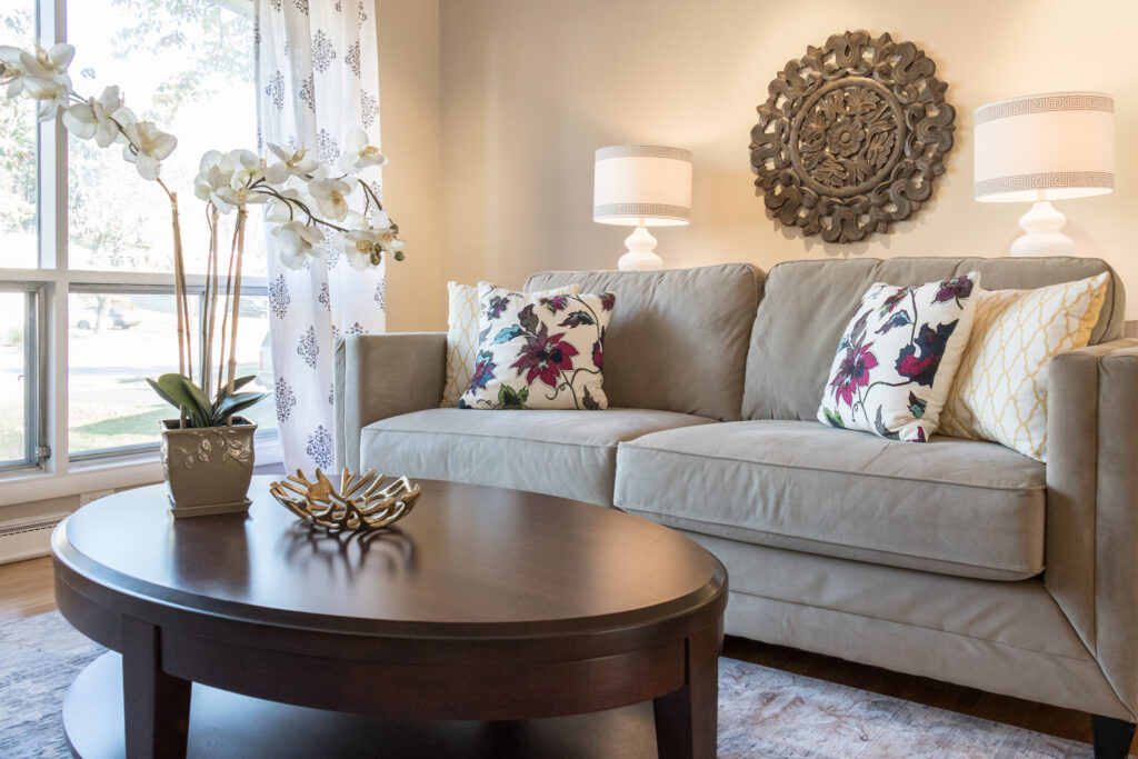
First, there is the sofa table option. If you have your sofa on a long wall–and many people do–bring it into the space about 18 inches if you can and pop a sofa table behind it as we did here:
photograph: Ashlee Hall
By adding a sofa table behind the sofa, we were able to add presence to the wall by adding lamps on either side of what normally would have been a piece of art way too small for the scale of this wall and sofa by itself.
Design tip: Look for a sofa table that is 60-72 inches long depending on the length of your sofa and that is very, very close to the height of the back of your sofa. Or, as we did in the image above, we actually placed two of the same table next to each other to create a longer table.
If you are not planning to move anytime soon, you can break up the wall with an architectural detail like picture frame moulding, like we did in the photo below. This wall is almost 25 feet:
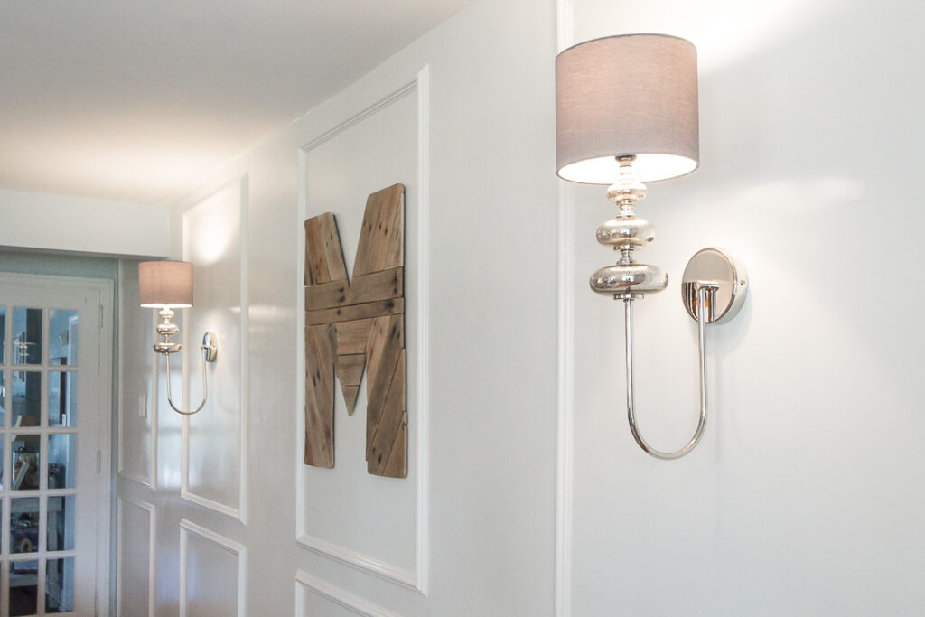
Photo Creds: Ashlee Hall
This is what the room looked like before and you can see that the homeowners did a nice job of trying to fill the wall but it just wasn't enough:
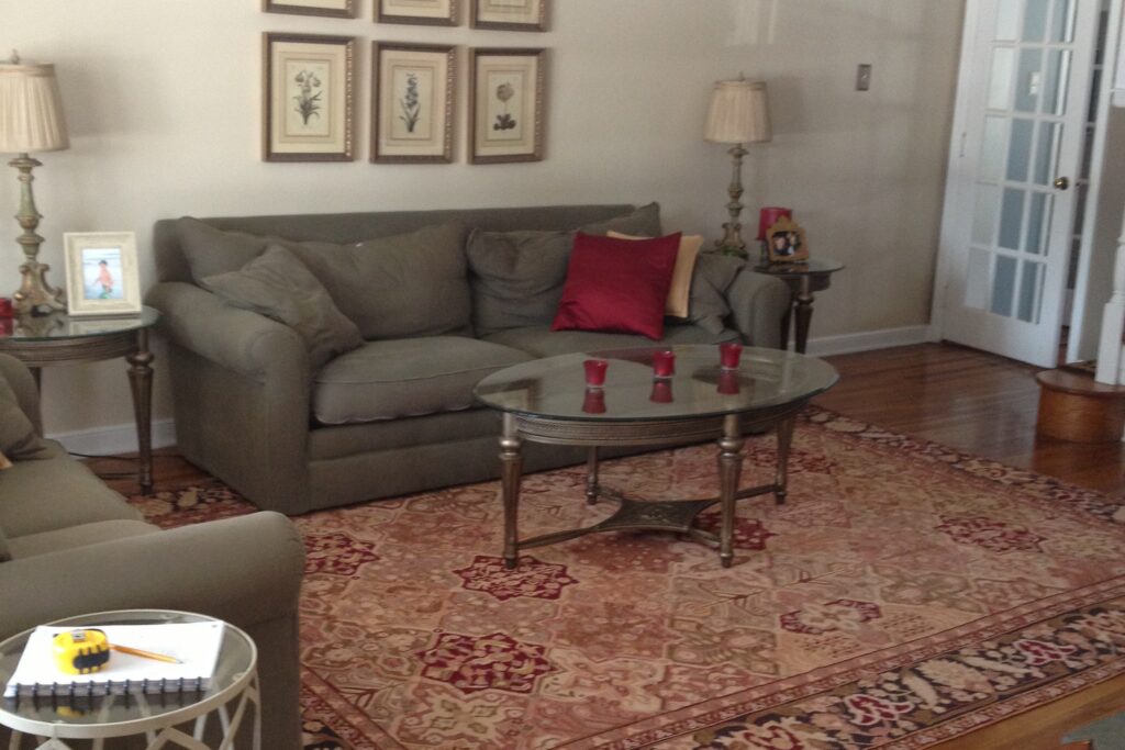
Photo Creds: Ashlee Hall
You really don't need to add much art to a wall like this because it becomes the art in the space all by itself. But, that reclaimed monogram is on point, in my humble opinion ; ) You can find a similar one here.
Another option is a series of art or photographs. You can go with several small pieces grouped in the same frame, in a linear fashion like this:
I absolutely love these gallery frames from West Elm and these from Ikea to create groupings. The only challenge with the Ikea ones is that it is an odd sized opening.
But…little design hack I have learned…you can get custom mats right here at Etsy and even Michael's Craft Store and AC Moore can make you a custom-sized mat! I feel like I should do a mic drop right there!
We also have used these amaaaaazing frames in a project recently. Gorgeous!! These can be customized to any size and they are such a statement. One word of caution is that they do produce glare so just consider the location when choosing these.
Or you can go with a few nice, healthy-sized pieces of art like this:
Minted.com is one of my go-to resources for art that you can have made up in many sizes and configurations and have framed by them (their prices, by the way, are pretty great) or you can have them framed with a local resource. I like to pin my art pieces to a Pinterest board to see if a grouping will play nicely together.
Here's something else that is super, super important so listen up….
The key to grouping your art is to keep the spacing close between the pieces (between 2-3 inches max).
A cool thing that I learned from one of our interns who had to learn how to measure everything just using your hands, arms and feet–crazy, right!?–is that the width of my hand from index finger to pink is approximately 2-1/2 inches.
Check it out and see if yours falls in that 2-3 inches range and you will never need to get out your tape measure again to hang art groupings ; )
Creds: Ashlee Hall
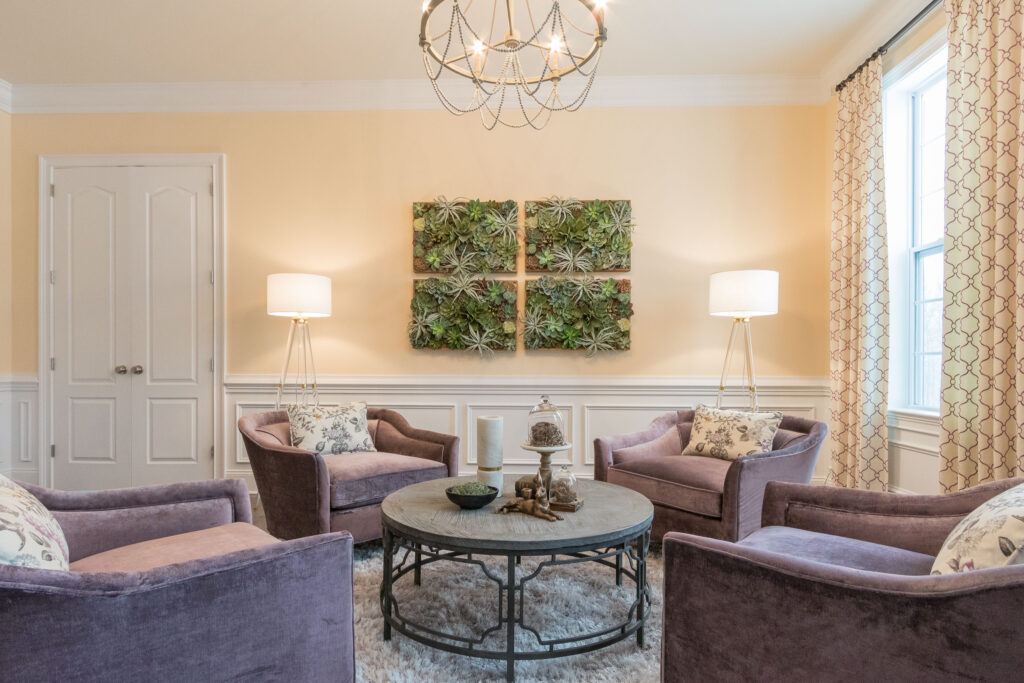
How gorgeous is that succulent wall art (and perfectly hung by my client's hubs, I might add)? You can find it here.
You can also break up the wall with freestanding bookshelves like was done in the dreamy photo below. But, be careful that you don't turn those shelves into a free-for-all of accessories!!
Another option is to turn the whole wall into art by using a wallovering like we did here with this mural from Anthropologie:
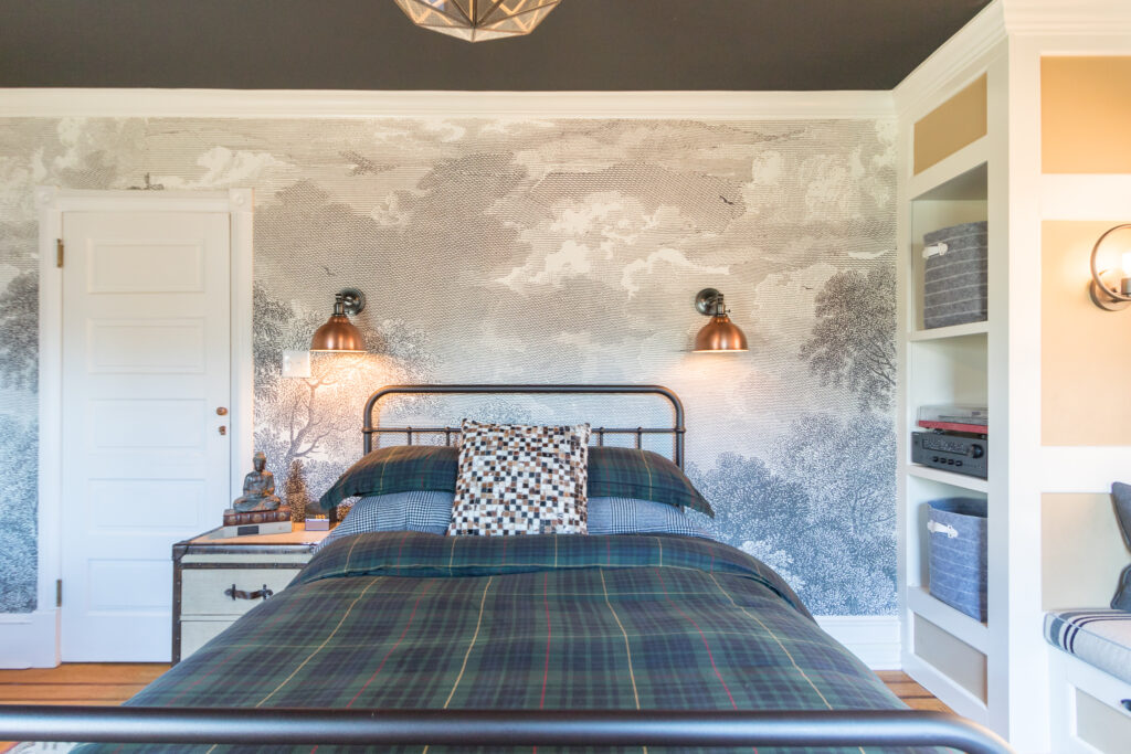
Photo Creds: Ashlee Hall
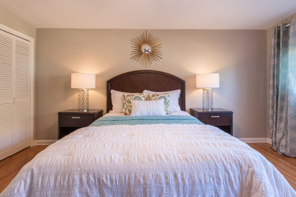
And sometimes you just need big lamps! What's with all of the teeny, tiny lamps out there? At your bedside, you really should go for a lamp that is somewhere between 25″-27″ tall so that you might actually be able to read in bed.
Creds: Ashlee Hall
Although is that passe? Aren't we all just using our ipads and such?
Functionality aside, beauty, scale and proportion should win the day when styling your house to sell or dwell. Go for taller lamps to offset the size and scale of your bed and headboard and I promise, you will be happy with the result.
The other tricks that we used in accessorizing the long wall above, were to add a taller headboard–which took up more visual space and had greater presence–and add larger side tables. The mirror over the bed on its own with small lamps would have been completely lost and that is so not good.
Looking for more home staging tips?
If these are some of the questions that you have, I touch on creating focal points in my new book, “Sell Your House in 72 Hours: The Art of Real Estate Styling” which you can download for FREE!
If you are a total overachiever (no judgment, I'm guilty of it too ; ) and you want to learn even more, I go into much more detail about styling focal points in my Ultimate Staging Starter Kit. This is a great resource for sellers, Realtors and emerging Home Stagers.
xo,
Lori
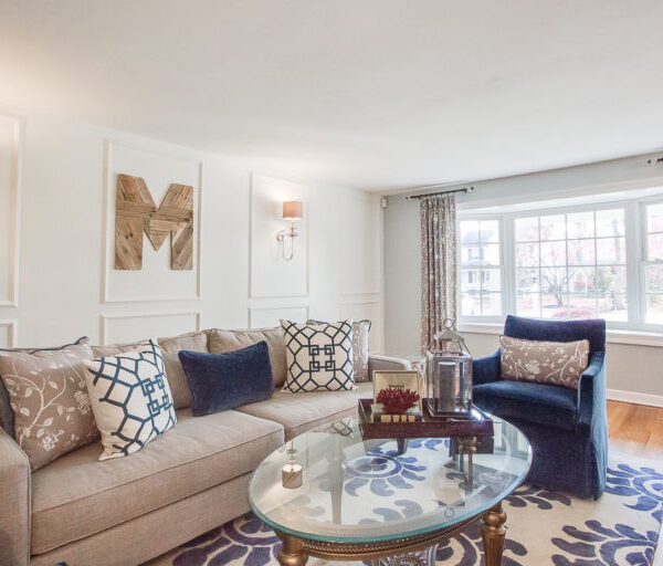
Hi Lori! I was hoping you could tell me what is the color of the room (that is also in your book) with the gray couch and dark gray chairs and floral pillows? I’ve been looking for a color exactly like that for ages and can’t find anything exactly right.
Love your book! I know it’s going to help me sell my house fast.
Hi Rhiannon! Thank you so much for all of your kind words! The wall colors are Benjamin Moore Pale Smoke and Vanilla Milkshake. Definitely test them in your space first because sometimes the translation between the color on the screen and in the space isn’t seamless. Best of luck getting your house ready to sell! If you want a deeper dive, check out the course “Stage Your House To Sell”